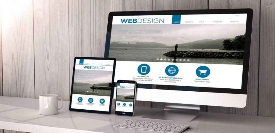
A website has many elements that make it work perfectly and provide all the benefits to you. The most necessary thing to business is its website, and it plays the most important role in exposure. You may know that the vast number of traffic comes from Smartphone user. So, it is necessary that your website performs well on cross platforms and provide the similar functionality as it offers in the full-fledged version.
If you consider most of the people who are trying to come up with a new website for their business, they don’t pay attention to mobile-friendly design in the beginning. Well, it can set you in many issues, or it doesn’t let you get the benefits of all the resources. In order to eradicate such issues and get the best out of it, the below given are the top five tips which you can try out and have a responsive web design for mobile devices.
1. Using Responsive framework
A framework can make the work easier and comes handy in various manners. There are many platforms for the framework, and you can choose any of them considering the pros and cons. Things become easier, and getting the best design for your website is really simple. Make sure that you stay selective in approach and find the design which is responsive.
You have the option to check out existing templates, and if you want to try a custom one, then you should opt for custom framework developers. The best developers can make things easier and provide a website that will work perfectly and fulfill your need with ease. It is a simple way to proceed and get a responsive website.
Symfony and many other platforms offer a great flexibility along with templates. So, you can rely on those designs and avoid most of the trouble in the single go. Make sure that you stay selective for the platform because it matters a lot in the responsiveness of a website.
2. Navigation Is the Key
In the development work, you have to consider every single thing wisely and place all the navigation buttons in the right places. It doesn’t matter which platform you prefer. If the website is not responsive enough, you are not going to get the benefits out of it. In such conditions, you have to know about the analytics of the website.
By placing the items or links at the top, which are highly preferred by most of the people, you can end the trouble and come up with a better UI. In other words, you are enhancing the user experience and making them do whatever they want, and it won’t let them feel irritated. Many websites are good in the full version, but they are not that much functional when it comes to the Smartphone.
Apart from it, if the design is too heavy, then the smartphones can face issues while loading it. To settle it down, you have to optimize the content and keep it light. Following these tips will decrease the size of your website, and most of the customers will be able to use it without any single issue.
3. Optimizing Content
There is no doubt that content is everything, and if the content exceeds the word limit or is too difficult to read, very few people will check the entire content. You should optimize the content if you want to sort out this issue and never face single trouble. There are many methods, but the easiest method is to keep the content short and simple for an effective mobile-friendly design that works flawlessly.
The short content is easy to read, and most of the people will go through it even if they are not opting for it. By such methods, you are making the website much more responsive and highly reliable to prefer. In case, the content is short but have typical words; then it is also big trouble. The simplicity is always going to lead, and you can consider this tip here also.
Try to use simple English vocabulary that is easy to read, and almost everyone knows about it. Using typical words can make it hard for everyone, and no one is going to use a dictionary for that.
4. Using Simple Icons
As mentioned before, the use of simple words can kill most of the big lines, and the use of the right vocabulary will make line simpler. However, there are many times when you can use simple icons, and you don’t have to use much text. Icons are easy to find, and everyone knows that he/she is going to click on it, whereas the links can be large, and very few people will click on that.
Apart from this, you have the option to use different size icon according to the priority list. These methods will help you keep the necessary things at the top and making your website clutter-free. It is one of the most used options, and you can also try it out and obtaining many numbers of benefits. During the selection of a mobile-friendly design development company, you should tell about your needs for sure.
5. Test On many Platforms
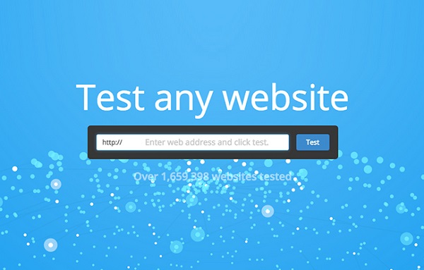
To know whether the design is responsive or not, you can consider visiting the same website from many devices. You can use the latest Smartphone of the time and the old ones. You should use different web browsers also. By such methods, you will test each and everything, which will make things easier for you. If the website doesn’t work perfectly, you should contact the developers for it.
In addition to this, you can use Geolocation which is a new feature. It will help you know the location of the visitor by permissions and serving what he/she may be opting for. These are easy methods to enhance the UX and making a website work perfectly. You can try such methods now and go well in the future also. Hope, this post will let you learn the basics with ease.
Read Also